
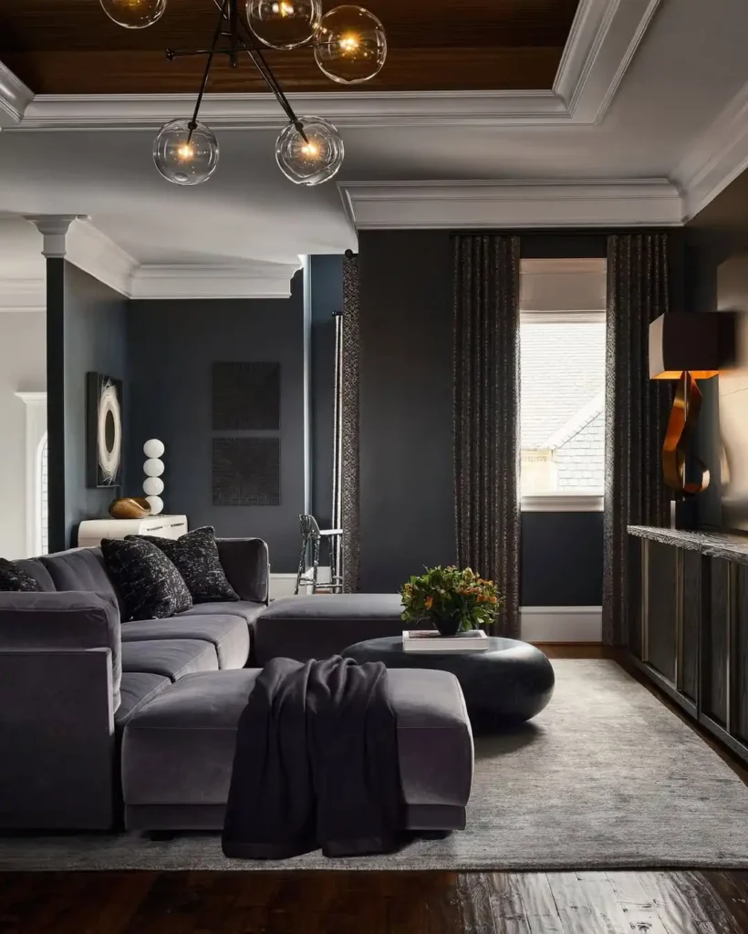
Let’s be honest for a second. For years, we were all told to paint everything white, beige, or greige to make rooms look bigger. But what if I told you that the biggest design secret of 2026 isn’t about making a room look larger—but making it feel warmer and more intimate?
I’m talking about dark and moody wall colors.
Deep charcoals, inky navies, dramatic forest greens, and rich espresso browns are taking over interiors. And honestly? They might just be the coziest decision you ever make for your home. Today, I’m walking you through exactly how to choose, style, and fall in love with the dark side of decor.
Why Choose Dark Wall Colors?
There is a psychological shift that happens when you paint a room dark. Instead of bouncing light around to create energy, dark walls absorb light, creating a visual “cocoon.” It makes the room feel secure, grounded, and incredibly peaceful.
Think about it:
- A dark bedroom tells your brain it is time to wind down.
- A dark living room feels like a luxurious cinema or a vintage library.
- A dark office signals deep focus and creativity.
Dark walls don’t close a space in—they actually dissolve the hard edges of the walls, making the boundaries of the room feel limitless and soft.
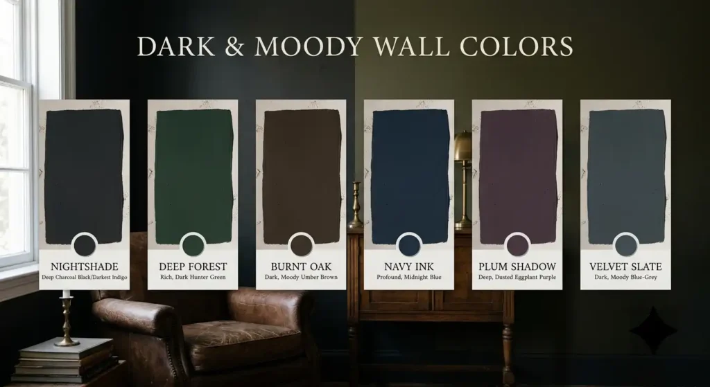
The Best Dark & Moody Paint Colors (By Vibe)
Not all dark paints are created equal. Here are my top expert-approved shades that actually work in real homes (tested by yours truly):
1. The Charismatic Charcoal
Vibe: Urban & Sophisticated
A deep, warm charcoal (like Sherwin-Williams Peppercorn) is the perfect gateway into dark colors. It pairs beautifully with white trim and wood accents, giving a modern, industrial-loft feel without feeling cold.
2. The Dramatic Navy
Vibe: Classic & Coastal
Navy blue (think Benjamin Moore Hale Navy) is timeless. It reads as a neutral, so it pairs with almost any accent color—from bright mustard yellows to crisp whites and warm brass.
3. The Enchanted Forest Green
Vibe: Organic & Earthy
This is a huge trend right now. Shades like Farrow & Ball Green Smoke or Sherwin-Williams Cypress bring the outdoors in. Pair this with natural woods, leather, and lots of indoor plants for a biophilic bliss.
4. The Bold Black/Brown (Espresso)
Vibe: Luxurious & Bold
Don’t shy away from pure depth. A dark espresso (like Benjamin Moore Black Beauty) can make a dining room or study look incredibly expensive and dramatic. It’s the ultimate power move.
How to Style Dark Walls (Without Making it Look Like a Cave)
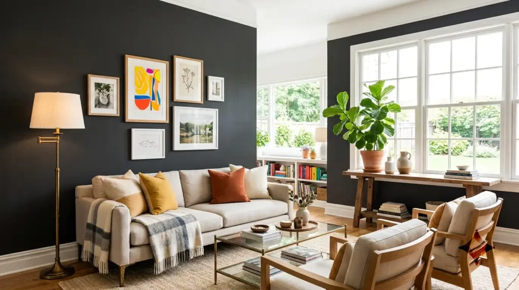
I get it—the fear is real. You don’t want to walk in and feel like you’re in a dungeon. Here are my 4 Golden Rules for styling dark walls successfully:
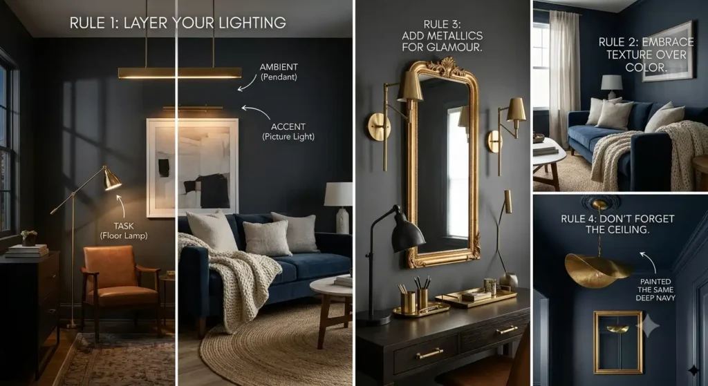
Rule 1: Layer Your Lighting
You cannot rely on one overhead light. You need layers:
- Ambient (overhead/dimmers)
- Task (reading lamps)
- Accent (wall sconces or picture lights)
The light hitting the dark paint creates beautiful shadows and depth, making the room feel incredibly high-end.
Rule 2: Embrace Texture Over Color
When your walls are dark, you don’t need a lot of color on the furniture. Instead, mix textures:
- A chunky knit throw
- A velvet sofa
- A jute or wool rug
- Linen curtains
This creates visual interest without looking cluttered.
Rule 3: Add Metallics for Glamour
Gold, brass, and blackened iron look stunning against dark walls. A brass floor lamp, gold-framed mirror, or brushed brass hardware will pop beautifully against charcoal or navy.
Rule 4: Don’t Forget the Ceiling
Here is a secret—paint the ceiling the same color as the walls, or just a shade lighter. It eliminates the hard line where the wall meets the ceiling, making the room feel taller and completely enveloping. It’s a pro-designer trick.
Which Rooms Should You Paint Dark?
| Room | Best Dark Shade | Why it Works |
|---|---|---|
| Living Room | Charcoal or Navy | Creates a cozy, intimate gathering space that feels like a hug. |
| Bedroom | Forest Green or Espresso | Promotes sleep and relaxation by lowering the room’s perceived energy. |
| Home Office | Deep Teal or Charcoal | Helps you focus and eliminates glare on computer screens. |
| Dining Room | Black or Burgundy | Adds drama, making dinner parties feel formal and luxurious. |
| Powder Bathroom | Any Dark Color! | It’s a small space—go bold! It makes a huge impact with very little paint. |
Common Mistakes to Avoid
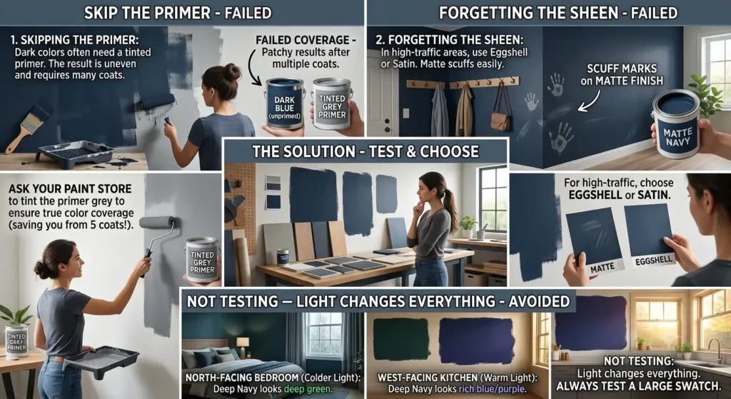
- Skipping the primer: Dark colors often need a tinted primer. Ask your paint store to tint the primer grey to ensure true color coverage (saving you from 5 coats!).
- Forgetting the sheen: In high-traffic areas, use an Eggshell or Satin finish. Matte is gorgeous, but it shows scuffs easily.
- Not testing: Light changes everything. A sample swatch might look black in your store’s fluorescent lighting, but deep green in your north-facing bedroom. Always test a large swatch.
Final Thoughts: The Dark Side is Bright
If you’ve been sitting on the fence about going dark, take this as your sign. Start with one accent wall, or go all in on a small powder room. I promise—once you experience the cozy, enveloping hug of a moody room, you’ll never look at beige the same way again.
Ready to dive in? Check out our curated picks for dark paint brands and lighting to match.
Let me know in the comments—which dark shade are you brave enough to try? Drop your pick below!
